


The "Unexpected Red Theory"
What is “The Unexpected Red Theory”?
One of the biggest buzz terms on social media lately has been the “Unexpected Red Theory”; the theory that a room never fully looks complete until a hint of red is injected. Like finishing off an outfit with a pop of classic red lipstick. The concept is that red- even on a small scale- keeps an otherwise cool-hued palette from looking flat. In fact, the more low-key and “unexpected”, the better.
I’ll be honest, I’m not a hug red gal. Or at least I never thought I was. Not into reds, pinks or oranges. Instead, I’m naturally drawn to cooler tones and neutrals. But then I noticed something; that indeed a lot of the aspirational interior images I loved did in fact contain a pop of red. Be it ruby, maroon, terracotta, or bright blood red, there was always a reddish tone incorporated by means of a piece of furniture, textile or even a small accessory. And when you put your hand over the red item, the room looks incomplete. When you remove your hand, the design looks cohesive and balanced.
Red in colour psychology
Red in colour psychology symbolises passion, strength and vitality. Its drama and evocative nature makes it the preferred choice for branding (think Coca-Cola, Netflix, Marvel, and many car and fast-food brands). It communicates narratives; Fast and furious, brimming with energy.
But on a softer note, it’s also a colour associated with love, passion, sensuality and desire. A colour you’d see in a nightclub, maybe, but few are brave enough to paint their front rooms and a lustful shade of scarlet. Fewer still would go for floor to ceiling blood red, the kind that would increase your heartrate just by looking at it.
So if red is such a risky colour, how can it improve the overall look of a space?
Here are a few unexpected ways to successfully incorporate red into your home.
Subtle pattern

Image from Carlos Gracia Interiors
As seen above, even the most subtle hint of red by means of the throw cushions and (the almost hard to spot) lamp adds a little something to this otherwise very neutral bedroom.
In contrast to blue
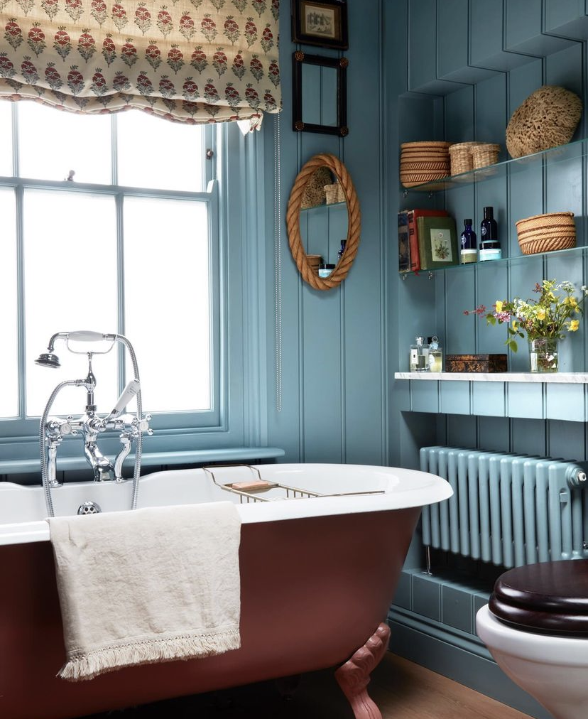
Image from Milo Brown.

Image from Chris Snook
Without the addition of the red seat pad, this dining nook would look incomplete. The red cuts through the blandness.
Red on red tones

Image from Ham Interiors
Mirroring the reddish hues in timber or brick, as seen above and below, creates a cohesive sense of coziness.

Image from Brooke Copp-Barton

Image from Brooke Copp-Barton
The element of surprise

Image from Decorilla.
The unexpectedness of “the unexpected red theory“ is what makes it work so well; the element of surprise is what breaks the monotony of the rooms we inhabit day in and day out.

Image from Veerle Evens.
Red as a primary colour

Image from Kit & Co.
Red dotted alongside blue and yellow- the primary colours- creates a youthful sense of joy. But keep the objects antique or mature to avoid a modern mish-mash that ends up reading “Montessori school“.
50 shades of… red?

Image from Shootfactory.
The titular colour in the “unexpected red theory” doesn’t have to be a strong primary red. The theory works just as well with terracotta, blush and currant.

Image from British Standard Cupboards.
Red in a minimalistic setting

Image from JTGrupa Architects.
One of the theories that red works so well is because of its evocative nature, and how it counteracts the blandness of pared-back minimalism.
Randy red, but make it sophisticated…!

Image from Megan Taylor.
Red affects us on a physiological level, and even just one strategically-placed red item in a room can arouse feelings of passion. Ideal for a love-nest. *wink*

Image from I Spy DIY.
Copy nature

Image from Brooke Copp-Barton.
Red is a complementary colour of green, making it stand out in natural contexts. Like ripe berries on a tree, red speckled throughout a room with green creates a sense of wholesomeness.
It commands attention

Image from Layered Interior.
Red is used not only as a warning sign (think “emergency” or “stop” signs), but a colour to capture and hold attention. Using it in focal points of a room says “This is the important spot for us to gather“. Ideal for a dining area.
For a very different- yet equally varied- look at the world of Red and all that it evokes, check out my recent post on Taylor Swift’s album Red and how it translates to interiors.
And for more interior design inspiration, take a look at my series of interiors-related blog posts.


